Create frequency charts
Key notes !
1. What is a Frequency Chart?
- A frequency chart is a table that displays the number of times (frequency) each value or category occurs in a dataset.
- It helps organize and summarize data to make it easier to analyze.
2. Parts of a Frequency Chart
- Categories/Values: The distinct values or categories that the data is grouped into.
- Frequency: The number of times each value or category appears in the dataset.
3. Steps to Create a Frequency Chart
- Step 1: Collect Data: Gather the data you want to organize into a frequency chart.
- Step 2: Organize Data: List all the distinct values or categories in your data. These will form the rows of your frequency chart.
- Step 3: Tally the Frequencies:
- Go through the data and count how many times each value or category occurs. This count is the frequency.
- You can use a tally mark system (|||) to help count, then convert tallies into numbers.
- Step 4: Record the Frequencies:
- Write down the frequency next to each value or category in the chart.
4. Example of a Frequency Chart
Suppose you surveyed a class on their favorite fruit, and the results were as follows: Apple, Banana, Apple, Orange, Banana, Banana, Apple, Orange, Apple.
- Value (Fruit) | Frequency
- Apple | 4
- Banana | 3
- Orange | 2
5. Using Frequency Charts
- Frequency charts are useful for quickly understanding which values or categories are most or least common in a dataset.
- They can also be used as a precursor to creating more complex graphs, such as bar graphs or histograms.
6. Common Mistakes to Avoid
- Missing Values: Ensure every distinct value in the data is included in the chart.
- Incorrect Counts: Double-check the frequency counts to make sure they are accurate.
- Unclear Categories: Clearly define and list categories to avoid confusion.
7. Applications of Frequency Charts
- Frequency charts are used in various fields, such as statistics, surveys, and research, to organize and analyze data.
- They help identify trends, patterns, and outliers in the data.
8. Interpreting Frequency Charts
- Identify Most/Least Frequent Values: Look at the frequency column to see which values appear most and least often.
- Analyze Patterns: Use the chart to spot any patterns, such as whether certain categories dominate or are underrepresented.
Learn with an example
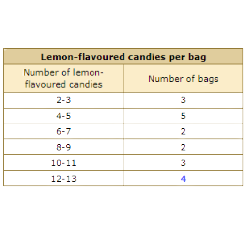
🔔 A machine at the candy factory dispensed different numbers of lemon-flavored candies into various bags.
Use the data to complete the frequency chart below.
Lemon-flavoured candies per bag
2 3 3 4 4 5 5 5 6 7 9 9 10 10 10 12 12 12 13
Fill in the missing number.
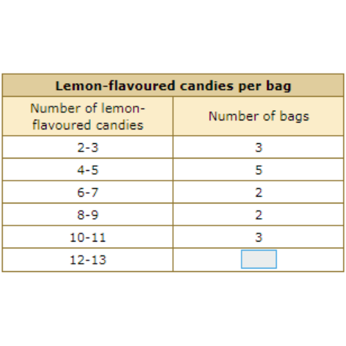
The missing row is for 12-13. 4 bags had between 12 and 13 lemon-flavored candies. The missing number is 4.
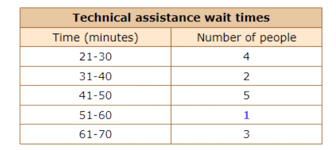
🔔 A Technical Assistance Manager monitored his customers’ wait times.
Use the data to complete the frequency chart below.
Technical assistance wait times (minutes)
21 21 22 25 35 37 44 47 48 48 48 58 62 64 69
Fill in the missing number.
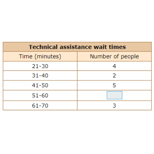
The missing row is for 51-60. 1 person waited for between 51 and 60 minutes. The missing number is 1.
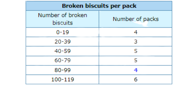
🔔 A biscuit factory monitored the number of broken biscuits per pack yesterday.
Use the data to complete the frequency chart below.
Broken biscuits per pack
68 62 105 107 22 13 54 9 108 101 57 90 84 62 10 101 108 0 52 58 67 30 66 28 81 54 85
Fill in the missing number
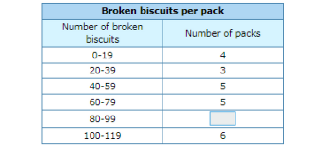
The missing row is for 80-99. 4 packs had between 80 and 99 broken biscuits. The missing number is 4.
Let’s practice!🖊️