Interpret line graphs
Key notes !
1. What is a Line Graph?
- A line graph is a type of chart that displays data points connected by a line, showing how something changes over time or in relation to another variable.
- It is useful for visualizing trends, patterns, and changes in data.

2. Parts of a Line Graph
- Title: Explains what the graph is about.
- X-axis (Horizontal axis): Represents the independent variable, often time or categories.
- Y-axis (Vertical axis): Represents the dependent variable, typically the quantity being measured.
- Data Points: Individual points that show the value of the data at specific intervals.
- Line: Connects the data points to show the trend over time or across categories.
3. Steps to Interpret a Line Graph
- Step 1: Read the Title: Understand the purpose of the graph and what it represents.
- Step 2: Analyze the Axes:
- Look at the X-axis to identify the independent variable (e.g., time, months, years).
- Look at the Y-axis to understand what is being measured (e.g., temperature, sales, population).
- Step 3: Examine the Data Points: Identify key data points on the graph, noting their exact values.
- Step 4: Observe the Trend:
- Determine whether the line is going up, down, or staying flat.
- A rising line indicates an increase, a falling line indicates a decrease, and a flat line indicates no change.
- Step 5: Identify Patterns: Look for patterns such as peaks (high points), troughs (low points), or cycles (repeating patterns).
4. Common Patterns in Line Graphs
- Upward Trend: The line goes up, indicating an increase over time.
- Downward Trend: The line goes down, indicating a decrease over time.
- Constant Trend: The line is flat, showing that there is no significant change.
- Fluctuating Trend: The line moves up and down, indicating variability or irregular changes.
5. Using Line Graphs
- Line graphs are useful for tracking changes over periods of time, such as monitoring temperature changes, sales growth, or population shifts.
- They can also compare multiple data sets by using different lines on the same graph.
6. Interpreting Multiple Lines
- Comparing Trends: When multiple lines are present, compare their slopes to see which data set is increasing or decreasing faster.
- Intersection Points: Note where lines intersect, as this indicates points where the data sets had the same value.
7. Common Mistakes to Avoid
- Misreading Axes: Always check the scales on the X and Y axes to ensure accurate interpretation.
- Ignoring Data Points: Each point on the graph represents an important piece of information; do not overlook them.
- Overlooking the Line’s Shape: The shape of the line (e.g., steep, gradual, flat) provides insights into the nature of the data’s change.
8. Applications of Line Graphs
- Line graphs are used in various fields such as economics, science, and social studies to show trends over time or to compare different data sets.
- They are particularly useful for predicting future trends based on past data.
Examples :

graph :

Learn with an example
🔔 To monitor the health of her tomato plants, Mrs. Evans recorded the number of tomatoes that grow in her garden each year.
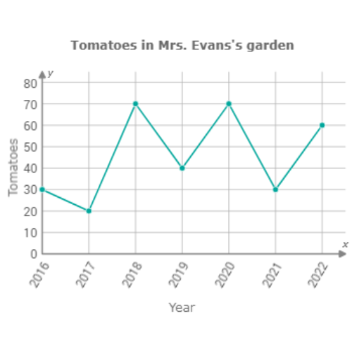
In which year did exactly 60 tomatoes grow in Mrs. Evans’s garden?
- 2016
- 2019
- 2021
- 2022
Find 60 on the graph. Look for the dot that shows 60.
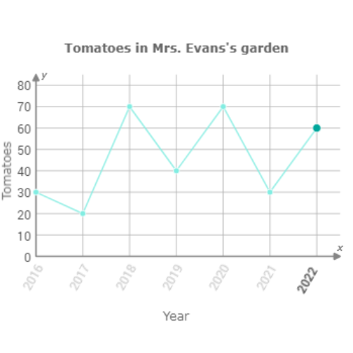
Exactly 60 tomatoes grew in Mrs. Evans’s garden in 2022.
🔔 To track droughts, the Valpoi City Council recorded the average depth of the Valpoi Reservoir each year.
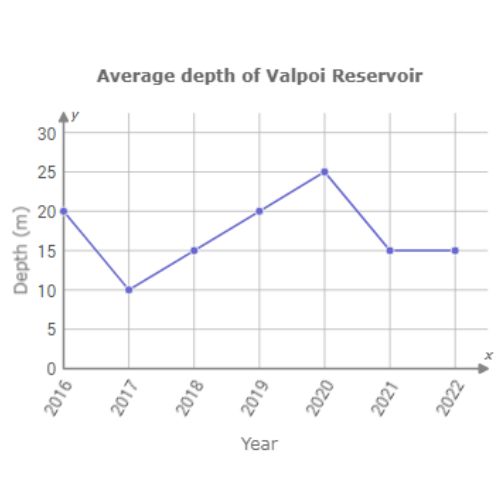
What was the average depth of Valpoi Reservoir in 2019?
_______ metres
Find 2019 on the graph. Look for the dot above 2019.
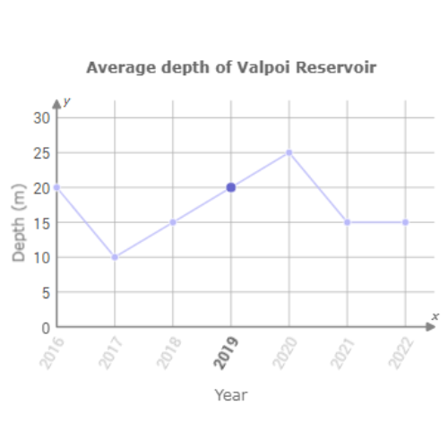
In 2019, the average depth of Valpoi Reservoir was 20 metres.
🔔 Clive’s favourite shoe store used customer management software to track the shoes he purchased each year.
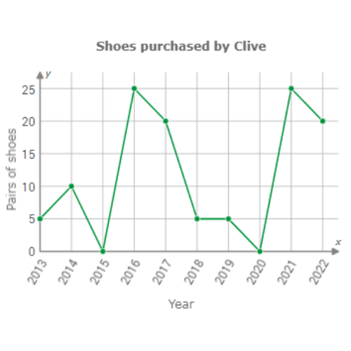
How many pairs of shoes did Clive purchase in 2019?
_____ pairs of shoes
Find 2019 on the graph. Look for the dot above 2019.
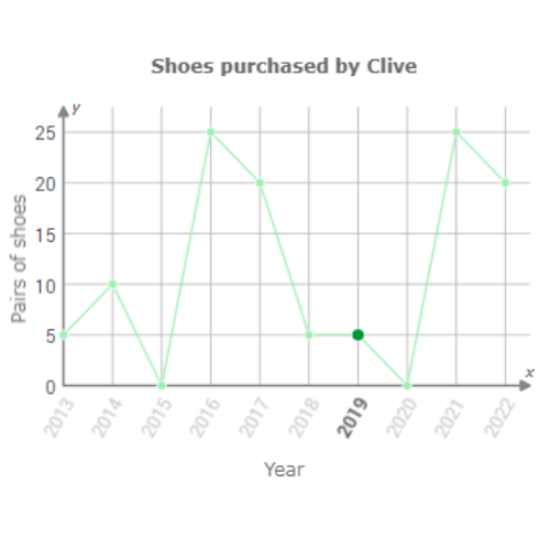
In 2019, Clive purchased 5 pairs of shoes.
Let’s practice!🖊️