Interpret line plots
Key Notes !
1. Definition of a Line Plot
- A line plot is a type of graph that displays data along a number line. It is used to show the frequency of data points.
- Each data point is represented by an “X” (or other markers) placed above a number on the line.

2. Components of a Line Plot
- Title: Explains what the line plot is about.
- Number Line: The horizontal axis (x-axis) that shows the range of values or categories being measured.
- Markers: “X”s or dots are placed above the numbers to represent the frequency of each value.
3. Steps to Interpret a Line Plot
- Read the Title: Understand what the data represents.
- Examine the Number Line: Identify the range of values and what each number represents.
- Count the Markers: Determine the frequency of each value by counting the “X”s or markers above each number.
- Analyze the Distribution: Look for patterns, such as clusters, gaps, or outliers.
4. Interpreting Data from a Line Plot
- Mode: The value with the most markers above it is the mode, which indicates the most frequent data point.
- Range: The difference between the highest and lowest values on the number line.
- Outliers: Points that are significantly higher or lower than the other data points.
5. Example Interpretation
- If a line plot shows the number of books read by students in a month, you can:

- Identify the most common number of books read (the mode).
- Determine how many students read more or fewer books than the average.
- Spot any students who read an unusually high or low number of books (outliers).
6. Comparing Data
- Line plots allow you to compare data points easily and see the overall distribution.
- You can quickly identify trends, such as which values occur most frequently or which range of values is most common.
7. Common Mistakes to Avoid
- Misreading the Number Line: Ensure you correctly understand what each number represents.
- Incorrectly Counting Markers: Be precise when counting the markers to determine accurate frequencies.
- Ignoring Outliers: Pay attention to any data points that don’t fit the general pattern, as they can be important.
8. Applications of Line Plots
- Line plots are useful for small sets of data where it is important to see the frequency distribution.
- They are often used in science experiments, surveys, and other situations where data points are discrete and limited.
Learn with an example
▶️ Gabrielle and her friends recorded their scores while playing a board game.

Which score did the fewest people receive?
Find the column with the least number of marks. The column for 6 has the least number of marks. The fewest people scored 6.
▶️ At a school carnival, a curious student volunteer counted the number of times visitors to her booth spun the numbers 1 through 6.
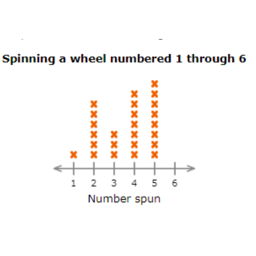
How many people spun a number less than 4?
______ People
Count all the X’s in the columns for 1, 2, or 3. There are 10 X’s. 10 people spun a number less than 4.
▶️ The coach of the Academic Bowl recorded the scores in a trivia game to determine who would represent the school at the regional competition.

How many people scored 10?
______ people
Count all the X’s in the column for 10. 5 people scored 10.
Let’s practice!🖊️