Interpret histograms
key notes :
1. Understanding Histograms
- A histogram is a type of bar graph that represents the distribution of numerical data by showing the frequency of data points within specified intervals (bins).
- Unlike bar graphs, histograms display data that is continuous, meaning the bars touch each other.
2. Parts of a Histogram
- Title: Describes what the histogram represents.
- X-axis (Horizontal axis): Represents the intervals or bins of data, showing the range of values grouped together.
- Y-axis (Vertical axis): Represents the frequency or count of data points within each interval.
- Bars: Each bar represents the frequency of data points within a specific interval. The height of the bar corresponds to how many data points fall within that interval.
3. Steps to Interpret a Histogram
- Step 1: Read the Title: Understand what the histogram is about.
- Step 2: Analyze the X-axis: Look at the intervals to understand the range of data being represented.
- Step 3: Analyze the Y-axis: Check the scale to understand the frequency of data points.
- Step 4: Examine the Bars: The height of each bar indicates how many data points fall within the corresponding interval.
- Step 5: Draw Conclusions: Use the histogram to identify patterns, such as which interval has the most or least data points.
4. Identifying Key Features in Histograms
- Peak (Mode): The tallest bar represents the interval with the highest frequency, also known as the mode.
- Spread: Look at how wide the data is spread across the intervals. This shows the range of the data.
- Skewness:
- Left-skewed (negative skew): Most data points are concentrated on the right side.
- Right-skewed (positive skew): Most data points are concentrated on the left side.
- Symmetrical: Data is evenly distributed on both sides of the peak.
5. Comparing Histograms
- Compare different histograms by looking at the spread, peak, and skewness to understand how the distributions differ.
- Compare the height of bars in different histograms to see which data set has more frequent values within certain intervals.
6. Common Mistakes to Avoid
- Misinterpreting the intervals: Remember that each bar represents the frequency of data within a specific interval, not individual values.
- Confusing histograms with bar graphs: Unlike bar graphs, the bars in histograms touch because the data is continuous.
7. Applications of Histograms
- Histograms are often used in statistics to display the distribution of data points, such as test scores, temperatures, or any other quantitative data.
- They help in identifying the central tendency, spread, and overall shape of the data distribution.
Learn with an example
🔔 The staff of a game show tracked the performance of all the contestants during the past season.
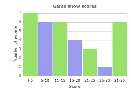
Which score range was achieved by the most people?
- 1-5 points
- 6-10 points
- 21-25 points
- 31-35 points
Find the tallest bar. The tallest bar is for the range 1-5.
The score range 1-5 was achieved by the most people.
🔔 Dr. Baldwin, a paediatrician, weighed all the children who recently visited her office.
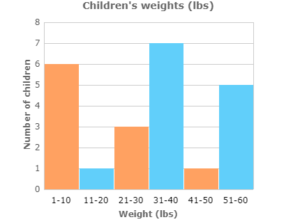
How many children weighed between 11 and 20 pounds?
_________children
Find the bar for the range 11-20. Using the scale on the left side of the graph, read the height of the bar. The height of the bar is 1.
1 child weighed between 11 and 20 pounds.
🔔While hanging Christmas lights for neighbours, Lorenzo counted the number of broken lights on each string.
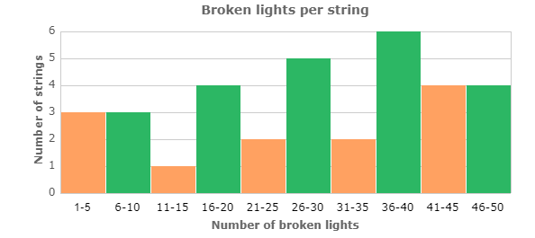
Which range of broken lights per string occurred least frequently?
- 1- 5 broken lights
- 11- 15 broken lights
- 21- 25 broken lights
- 26-30 broken lights
Find the shortest bar. The shortest bar is for the range 11-15.
The range 11-15 occurred least frequently.
Let’s practice!🖊️